We Help Startup to Make Product that Users Love
User Experience Design Agency
↓


We’re your partner for helping in User Experience Design with friendly prices based in West Java, Indonesia. We pour passion into projects big and small, providing our expert clients with solutions to help them thrive. We specialize to create digital product based on user centric.
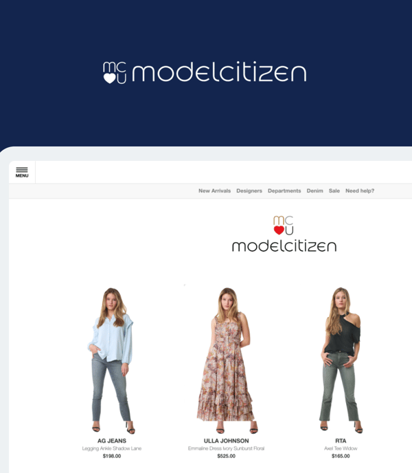
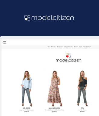
Modelcitizen
User Experience Design, Front End Dev
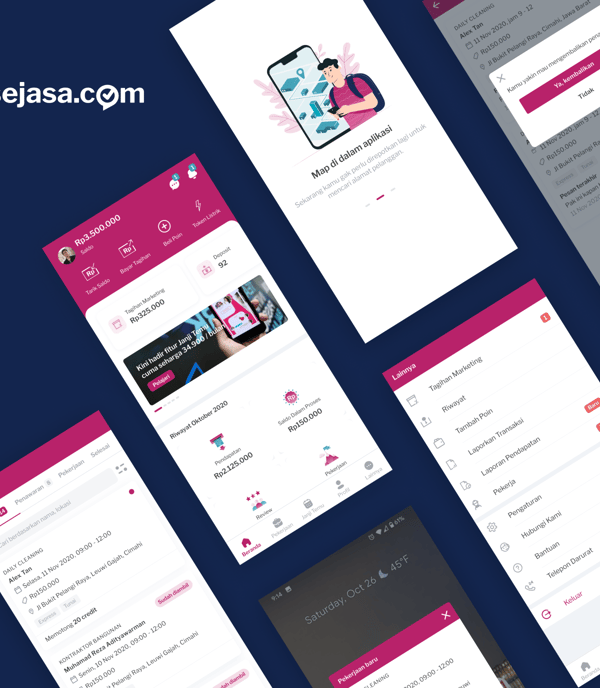
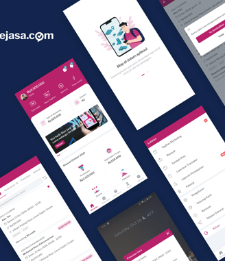
Service Provider Apps
User Interface, User Experience
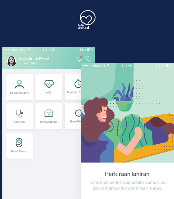
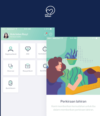
Bidan Sehati
User Interface, User Experience, Design Thinking

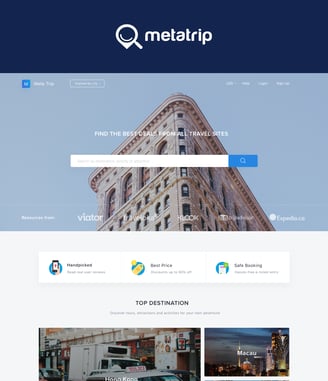
MetaTrip
User Interface, User Experience
Client Review
Connor Adams
Co-founder and VP Growth
USA
"Working with M. Reza and team was a great experience. They clearly understood the scope of work, was diligent in adhering to deadlines, and delivered a high quality finished product. I'd highly recommend hoomix to others."
Christian Legorreta
Co-founder GolfApp
Australia
"The team is talented and is easy to work with. They is always flexible to include your vision and feedback. I always enjoy working with Reza & team :) "
Abraham Auzan
Co-Founder Sehati TeleCTG
Indonesia
"The team is polite and communicates well. They is competent in the design process and design tools such Sketch, InVision and Zeplin. Jobs get executed promptly. Highly recommended."


Trusted by 60+ Client


Let’s work together
Hoomix
Jalan Bukit Pelangi Raya no 17-D
Cimahi, West Java
+62-8575-999-8687
reza@hoomix.me