When building a brand, we often focus on logos, colors, or visual design. However, there’s one element that’s often underestimated yet strongly influences customer perception: fonts.
Fonts are not just letters—they are the “visual voice” that speaks to your audience. Fonts can make a brand look professional, friendly, luxurious, or even outdated. That’s why choosing the right font is a crucial step in creating a consistent brand identity.
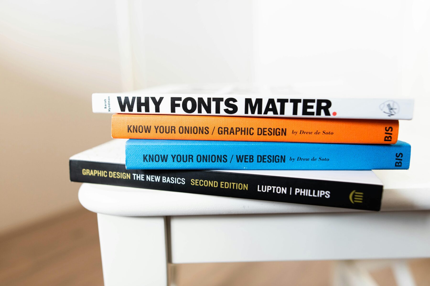
Why Fonts Matter for Branding
- Create a first impression – Fonts are noticed immediately, even before people read the words.
- Reflect brand personality – Serious, playful, elegant, or modern.
- Support visual consistency – Just like brand colors, fonts build a recognizable identity.
- Affect readability – Hard-to-read fonts can ruin the customer experience.
Types of Fonts and Their Character
- Serif Features: Small “hooks” or lines at the ends of letters. Impression: Traditional, elegant, professional, authoritative. Best for: Law firms, finance, academia, premium brands. Examples: Times New Roman, Georgia, Garamond.
- Sans Serif Features: Clean letters without “hooks.” Impression: Modern, simple, easy to read, approachable. Best for: Startups, digital SMEs, tech companies, fresh-looking brands. Examples: Helvetica, Open Sans, Poppins.
- Script Features: Resembles handwriting or calligraphy. Impression: Personal, artistic, feminine, emotional. Best for: Beauty brands, cafés, invitations, handmade products. Examples: Pacifico, Lobster, Great Vibes.
- Display / Decorative Features: Unique, stylized fonts, usually for titles. Impression: Creative, playful, bold. Best for: Brands that want to stand out, ads, posters, children’s products. Examples: Bebas Neue, Impact, Comic Neue.
How to Choose the Right Font for Your Brand
- Know your brand identity Serious or casual? Premium or affordable? Traditional or modern?
- Prioritize readability Avoid beautiful fonts that are hard to read, especially for long text.
- Use font combinations One font for headings (bold/unique). One font for body text (simple & easy to read). 👉 Limit to 2–3 fonts for consistency.
- Ensure consistency across media Use the same fonts on your website, brochures, social media, and packaging.
- Test with your audience Show font options to people in your target market and observe their reactions.
Examples of Font Choices by Industry
- Tech Startup: Sans Serif (modern, clean) → Poppins, Roboto.
- Food Business: Combination of Sans Serif + Script (friendly & personal).
- Premium Fashion: Serif + thin Sans Serif (elegant & luxurious).
- Creative/Children’s Products: Display (fun, unique) + Sans Serif (supporting text).
Conclusion
Choosing fonts is not just about aesthetics—it’s about how customers experience your brand. Serif can make a business look authoritative, Sans Serif conveys modernity, Script adds a personal touch, while Display makes a brand look bold. By selecting fonts that match your identity, remain consistent, and are easy to read, you can build a strong and memorable brand image.
Would you like me to suggest a tailored font pairing for your specific industry or brand personality?